
The Aga khan academies
UX/UI | WEBSITE MOBILE PROTOTYPE
The Aga Khan Academies case study explores the strategic redesign of their website to enhance user experience, particularly for mobile users. It highlights identifying user needs, reimagining the site's structure and design, and improving accessibility, ultimately aligning the website with the Academy's educational excellence.
RESEARCH > INTERVIEWS > DESIGN > TESTING
DELIVERABLES FOR THE CASE STUDY
Implement a responsive design that adjusts the layout based on the screen size. This way, content is easily readable and navigable whether it's viewed on a desktop, tablet, or smartphone.
My Role
UXUI Visual Designer
Timeline
2 weeks
Process
Research, Interviews, Card Sorting, Design testing, Ideation, information architecture, prototyping, testing, evaluation
Tools
Figma, Optimal Sorting
PROBLEM STATEMENT
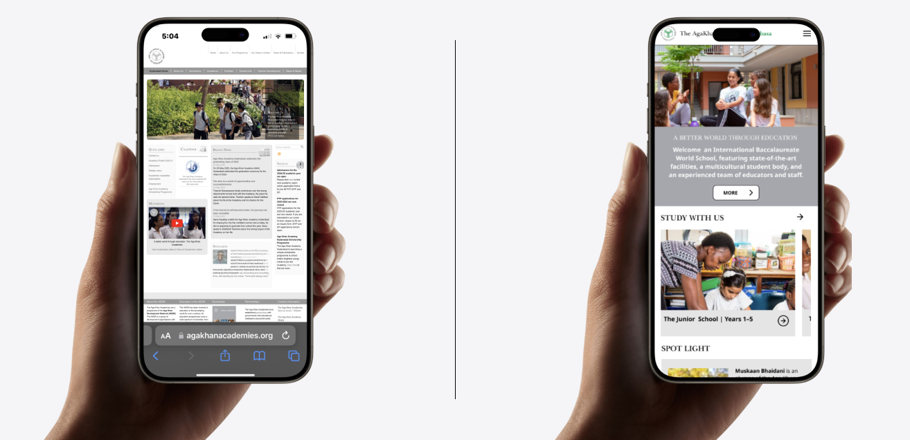
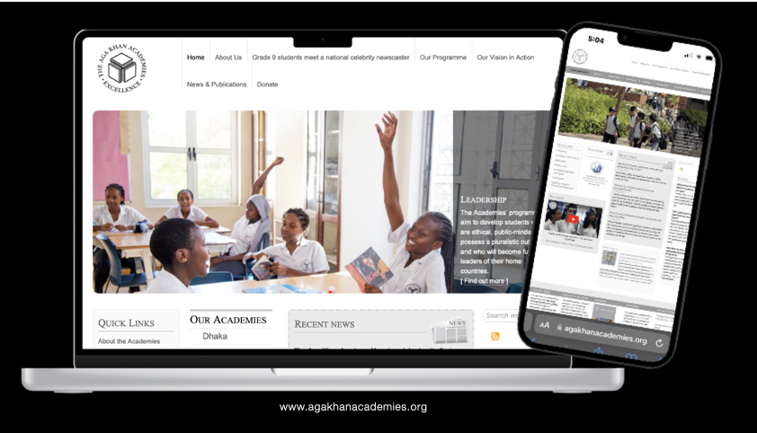
The Aga Khan Academies faced a challenge with their website's user experience, which was not optimized for mobile devices and presented navigation difficulties. The outdated design and content layout hindered accessibility, making it imperative to revitalise the digital interface to meet the evolving needs of their community.
RESEARCH
INTERVIEWS
Here's a summary of the points made by the interviewees:
Visual Appeal: Users find the website dull, grey, and unappealing, with everything looking bland and nothing standing out.
Language and Content: The language on the site is perceived as too authoritative. The content is described as heavy with too much text, making it difficult to read, especially on mobile devices requiring users to zoom in to navigate. There are too many repetitive elements, and some content, like forms, seems out of place or untrustworthy.
Navigation and Layout: Navigation is a common issue, with mentions of the main menu and other navigation elements not being prominent or intuitive. Dropdown are in the wrong places or unnecessary. The academy's logo isn't evident or challenging to read, and it's unclear how it differs from the primary logo.
Mobile Optimisation: A significant concern is the site's mobile-friendliness, with users struggling to use the site on mobile phones due to the need to zoom considerably and difficulty in clicking links.
Clarity and Accessibility: Suggestions include making the navigation buttons more explicit and accessible, reducing the number of items in the navigation list, and ensuring the navigation content reflects the title. Additionally, it's mentioned that the site's information is too cluttered.
Positive Feedback: Despite the issues, one User finds the navigation comprehensive and the site easy to follow, with another noting that the format has improved, becoming more accessible to read and follow.
This feedback indicates that while there are some positive aspects to the website's current iteration, there are several areas for improvement, particularly concerning visual design, content clarity, and mobile accessibility.
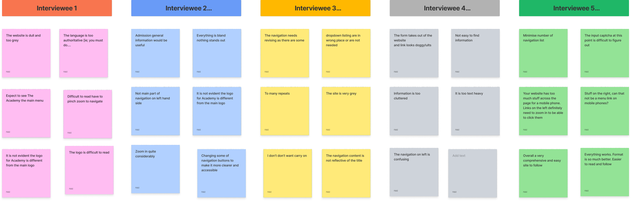
Interviewed: a total of 5 people on Zoom face to face, recorded experiences
INTERVIEWS TAKEAWAYS
Pain points
Mobile Optimisation: The website was not adequately optimised for mobile devices, leading to a subpar browsing experience for users on smartphones and tablets.
Navigation Issues: Users experienced difficulties with the site's navigation, which was not intuitive, making it hard to find necessary information quickly.
Outdated Design: The website's visual design was outdated, which could detract from the users' engagement and the Academy's modern educational ethos.
Content Layout: The layout was not user-friendly, contributing to a challenging user experience overall and potentially affecting the accessibility of vital information.

CARD SORTING
The results show:
'About the Academy', 'Meet our Team', 'Meet the Staff', 'Why Choose the Academy', 'Financial Assistance', 'Online Fee Payments', 'Academic Programme', and 'Enrichment Programmes' are unanimously placed under 'About Us'.
'The Junior and Senior School...', 'Application Forms', 'Fee Schedule', and 'Scholarship Programme' are predominantly associated with 'Admissions'.
'International Baccalaureate' and 'International Exchanges' have mixed placements but are primarily sorted under 'Academics'.
'The AKA Learner Profile' is evenly split between 'About Us' and 'Academics'.
'The Academies Network' is mostly placed under 'About Us', with some sorting it into 'Unsorted'.
'Residential Facilities', 'Our Campus', and 'Living on Campus' are considered part of ‘Facilities'.
'Meet Our School Community', 'Tours of the Academy', 'News', 'Newsletters', 'Videos', 'Publications', and 'Calendar' are mostly categorised under 'News & More…'.
The 'Unsorted' category contains various items where no clear consensus was reached, indicating areas where website information architecture could be improved for clarity.
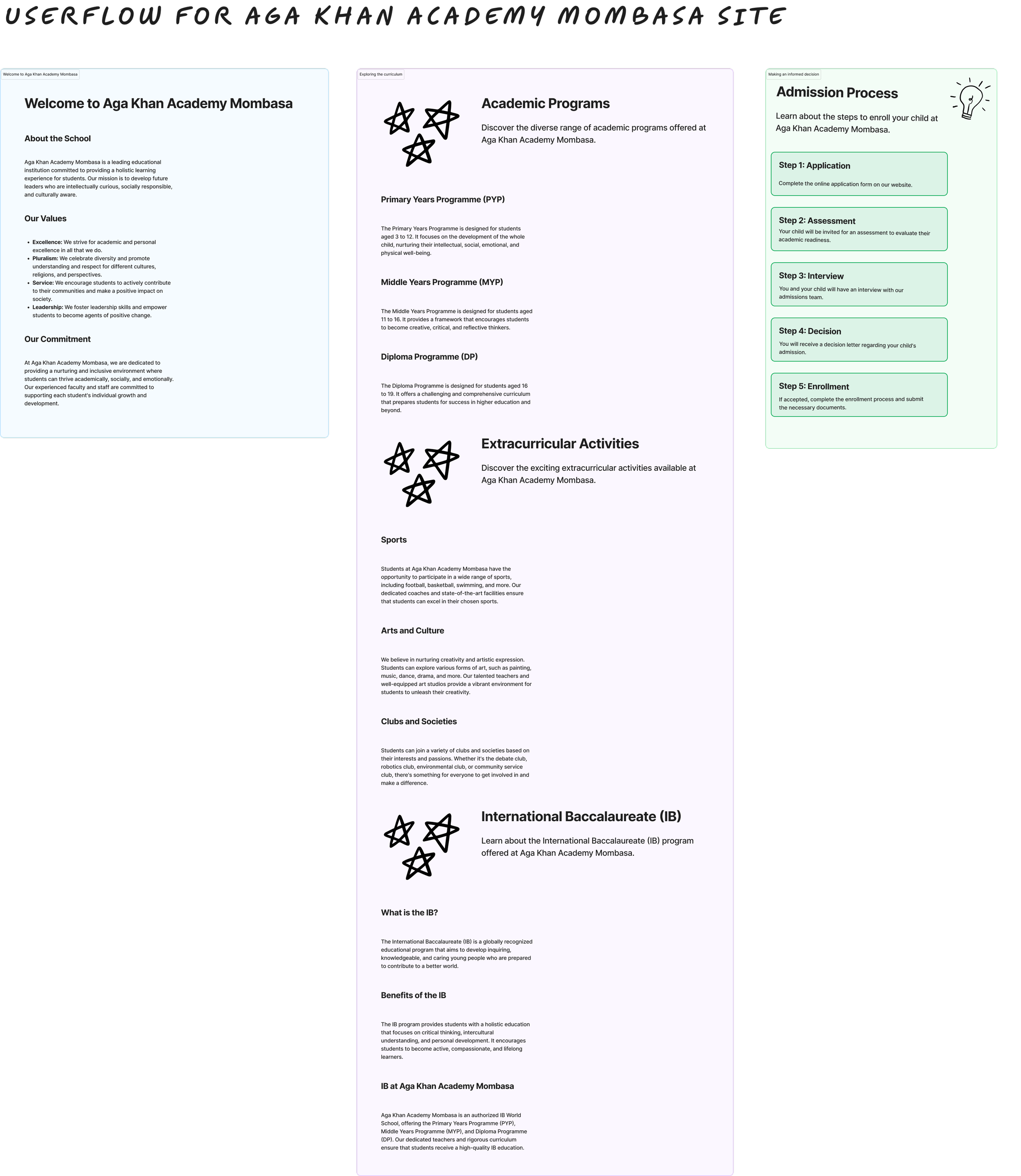
USER FLOW
Welcome to Aga Khan Academy Mombasa: This section introduces the school, outlining its values and commitment to education.
Academic Programs: Here, the diverse range of academic programs offered is detailed, including:
Primary Years Programme (PYP)
Middle Years Programme (MYP)
Diploma Programme (DP)
Extracurricular Activities: A section showcasing the extracurricular options available, such as sports, arts and culture, and various clubs and societies.
International Baccalaureate (IB): Information about the IB program is provided, including what the IB is and its benefits.
Admission Process: A step-by-step guide through the admissions process, broken down into:
Application
Assessment
Interview
Decision
Enrolment
This flow is designed to provide potential students and parents with a clear and informative path through the key aspects of the Academy, from introductory information to the specifics of the application process. It is visually structured to enhance understandability and ease of navigation.
Focus on User Experience: The redesign focused on the user journey of parents selecting a suitable school, with a specific emphasis on the Mombasa Academy.
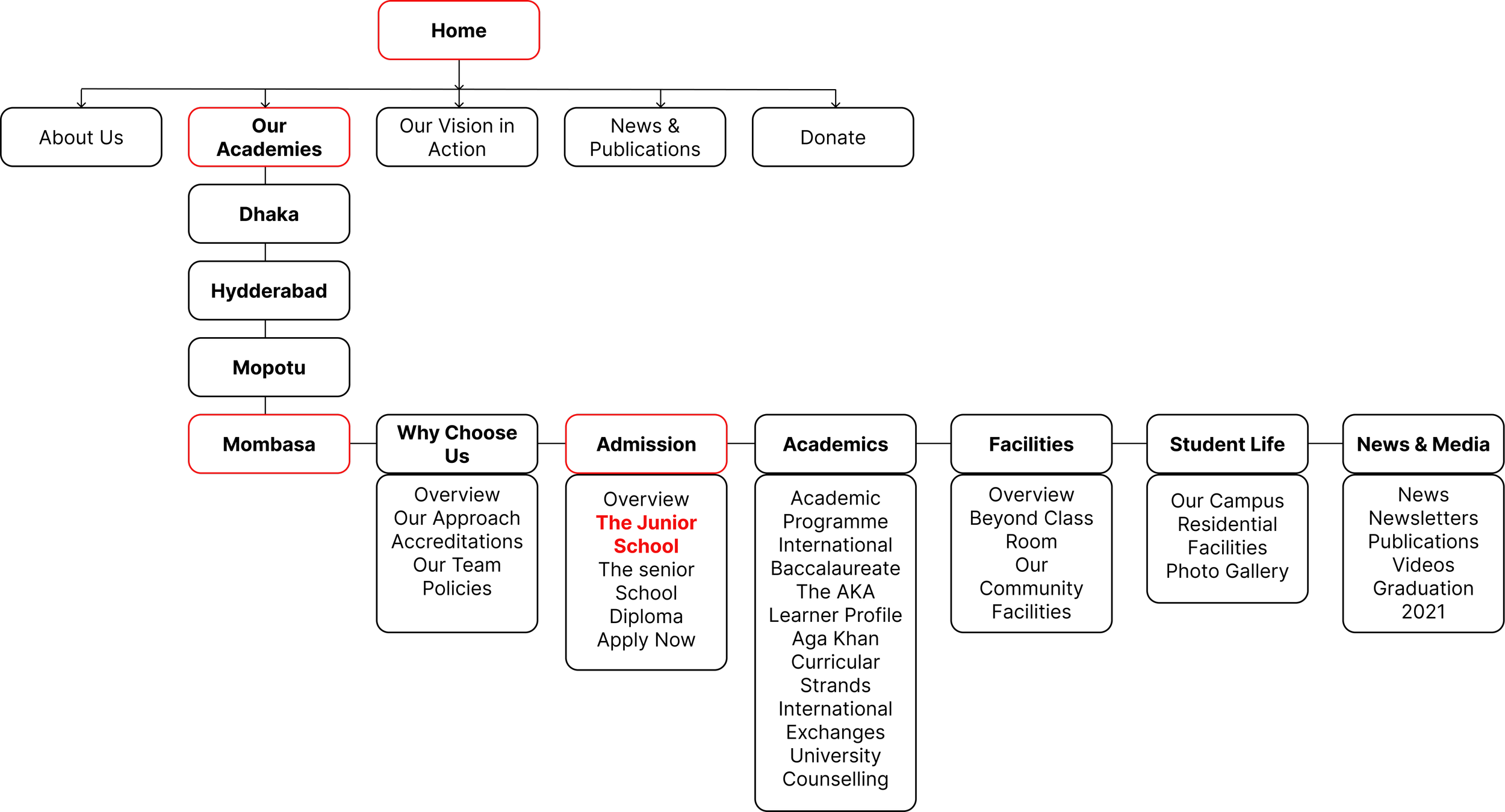
INFORMATION ARCHITECTURE
The information architecture has been developed based on insights from the card-sorting exercise and interview feedback. It is tailored to facilitate the User's Journey towards learning about the Mombasa Academy and the Junior School, emphasised as key focal points.
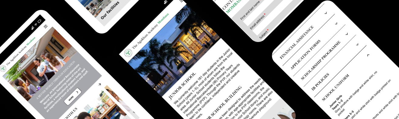
PROTOTYPE
HIGH FIDELITY PROTOTYPE
Problem Identification: The main issue was that the existing website was not mobile-friendly, difficult to navigate, and visually outdated. Parents, the primary users, found it challenging to access the site on mobile devices.
Research and Analysis: Interviews with users revealed pain points such as difficulty in navigation, cluttered information, heavy text content, and a lack of visual appeal.
Solution Approach: The proposed solution involved adopting a mobile-first design, enhancing visual appeal, simplifying navigation, optimizing for mobile devices, and improving search functionality.
Implementation Tools: Tools like Figma and card sorting exercises were used to redesign the website.
Focus on User Experience: The redesign focused on the user journey of parents selecting a suitable school, with a specific emphasis on the Mombasa Academy.
TESTING REVIEWS
Positive Aspects:
Rachel and Zaza commend the clean, modern layout, noting its improved navigability, particularly on mobile devices.
The clear and concise menu structure is appreciated, making it easier to find information.
The use of images and modern fonts, along with effective colour schemes, are highlighted as enhancing the website's visual appeal.
Specific features like the 'Study with Us' call to action and the school-specific information sections are well-received.
Areas for Improvement:
Rachel suggests clarifying specific section titles (like 'Multimedia') and questions the necessity of the 'Explore' section.
Zaza recommends further enhancing branding through colour and design and maintaining streamlined content with main headings.
Overall, both reviewers find the redesign significantly improved, offering a more user-friendly and accessible experience, with particular praise for its mobile optimization and effective use of visual elements.
TAKE AWAYS
Conclusion and Learnings:
Importance of Mobile Optimisation: This project underscores the necessity of a mobile-first approach in web design, considering the significant amount of traffic from mobile devices.
User-Centered Design: The case study demonstrates the value of understanding and addressing user needs, which, in this case, led to a more navigable and visually appealing website.
Effective Research Methods: Conducting interviews and card sorting exercises provided crucial insights into user behaviour and preferences, guiding the design process.
Recommended Enhancements for the Website
To further elevate the Aga Khan Academies' website, I suggest the following enhancements:
Comprehensive Information Architecture Review: While focusing primarily on the academies, a broader review of the complete information architecture will ensure that all site sections are intuitively structured and user-friendly.
Adopt a Conversational Tone in Content: Transitioning the site's language to a more conversational and engaging tone moving away from an overly formal or authoritative style, will enhance user connection and accessibility.
Develop a Dedicated Teachers/Parents Hub: Creating a specialised section for teachers and parents will provide targeted content, resources, and support tailored to their needs and interests.
Incorporate Cultural Sensitivity: Acknowledging the unique cultural context of each school within the website's content will resonate more with the local communities and reflect the global diversity of the Academies.
Enrich with Academy-Specific Media: Adding relevant images and videos for each Academy will offer a more vibrant and engaging portrayal of the school environments and activities.
Highlight Key School Statistics: Presenting 'At a glance' content that showcases school achievements, such as student-teacher ratios, exam success rates, and notable accomplishments, will provide quick, impactful insights to prospective students and parents.
These improvements aim to refine the user experience further, ensuring the website serves as an informational portal and a vibrant and engaging representation of the Aga Khan Academies' values and achievements.
WANT TO LEARN MORE? | LET’S TALK